

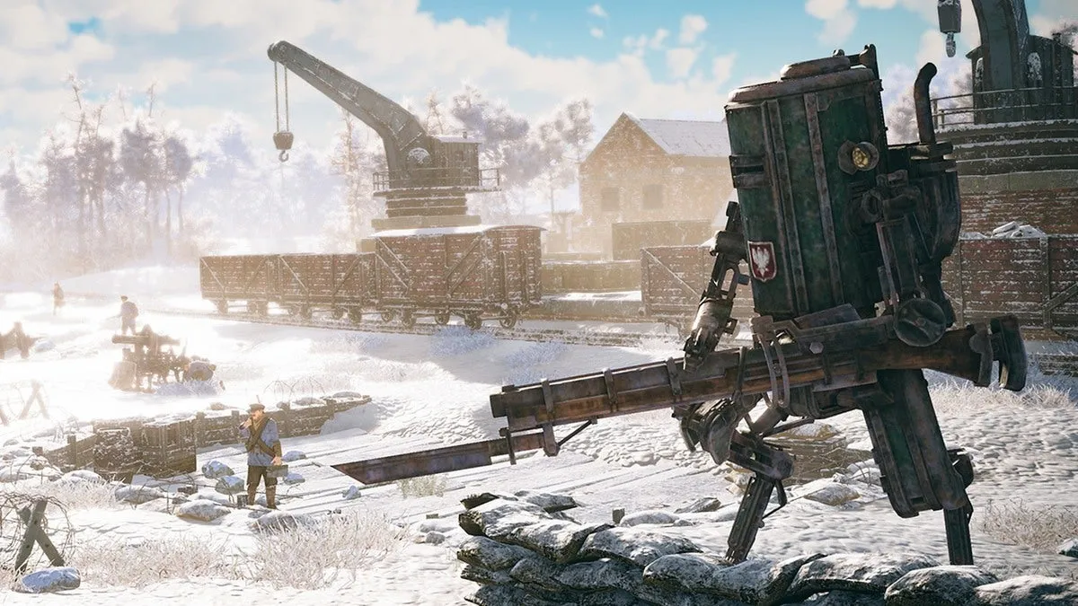
For the Iron Harvest Addon “Operation Eagle” we created over 30 new units and buildings, including the new unit type “Airships” and a completely new faction “Usonia”. This is our design process.
Iron Harvest is an RTS taking place in the World of 1920+, created by Polish artist Jakub Rozalski. In this alternative history version of our world, giant dieselpunk mechs dominated the battlefields of World War 1. The main game features three factions, Polania, Rusviet and Saxony, based on Poland, Russia and Germany.
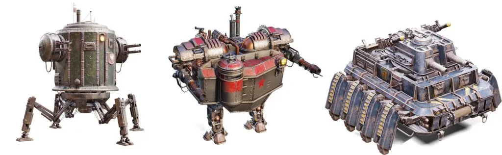
To give each faction personality and accommodate gameplay needs, we gave mechs certain traits. Polania mechs tend to be fast, lightly armored and featured round shapes. Rusviet mechs look kind of improvised, often have ship-like fronts and are slow but powerful. The Saxony Empire’s design doctrine is built upon technical superiority.
While getting closer to finishing the main game, some of the KING Art developers already started to work on the first big addon. At this point, we hadn’t decided on the new faction and the setting yet. We wanted an interesting addition to the main game and something new and unexpected (gameplaywise and artistically). The idea to introduce a completely new unit type, aircrafts, was born.
We were aware that some in the community were keen on getting one of the already established factions like the Shogunate (Japan). As much as we liked the idea of Samurai mechs, we felt that flying units from an economic powerhouse entering the world stage would offer greater value. So we created the 1920+ version of the United States, Usonia, and gave them an affinity for aviation.
To create a look and feel for the Usonian mechs and aircrafts we felt that ‘quantity over quality’ might be the right direction for the Usonian design language. Furthermore, we draw inspiration from the idea that Usonia could be about being patriotic and having a knack for spectacle, showmanship and self-glorification. Usonia is not about subtlety.
Visual Development
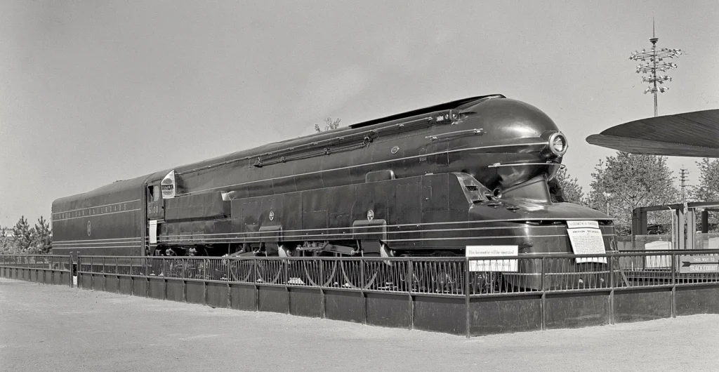
But what exactly would make our mechs and airships look American? What could be the 1920+ design language for Usonia? We could draw some inspiration for the soldier designs from the WW1 doughboys, but since the United States had a much smaller military presence back in the day, there wasn’t very much to look into. To represent the iconic American look-and-feel, we decided to look ahead from the 1920s to where their technical evolution led and found that the idea of an archaic streamline design paired with some art deco elements and loads of weaponry would be the way to go.
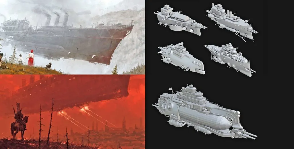
We defined this archaic streamline design by having overall more rounded and smooth shapes which often are constructed by smaller steel plating interrupted by repeating elements like vents for example. Studying old streamline trains and tractors, such as the design concepts from Raymond Loewy for example, helped us to create the look we wanted. For the airships Jakub already came up with some designs for his paintings in which they seem to be able to levitate without any physical explanation. And though we loved the designs and tried this direction in some of our earlier blockouts, we decided later on to make them look more physically believable, even though they still most probably wouldn’t be able to fly like this in the real world.
The Unit Creation Process
With this basic visual ideas and each unit’s constraints provided by our game designers in mind we started the production process with some rough blockouts which we discussed once a week with different departments like animation, rigging and game design.
And due to the Covid situation, these meetings, which sometimes took up several hours each, took place in Microsoft Teams. This allowed us to make fast design changes in real-time thanks to the screenshare functionality.
Step 1: Blockout
Based on the game designer’s ideas, we started to work on the basic functionalities for each model. In this example one of the challenges was to design a mech which weapons are able to cover a 360° around the mech.
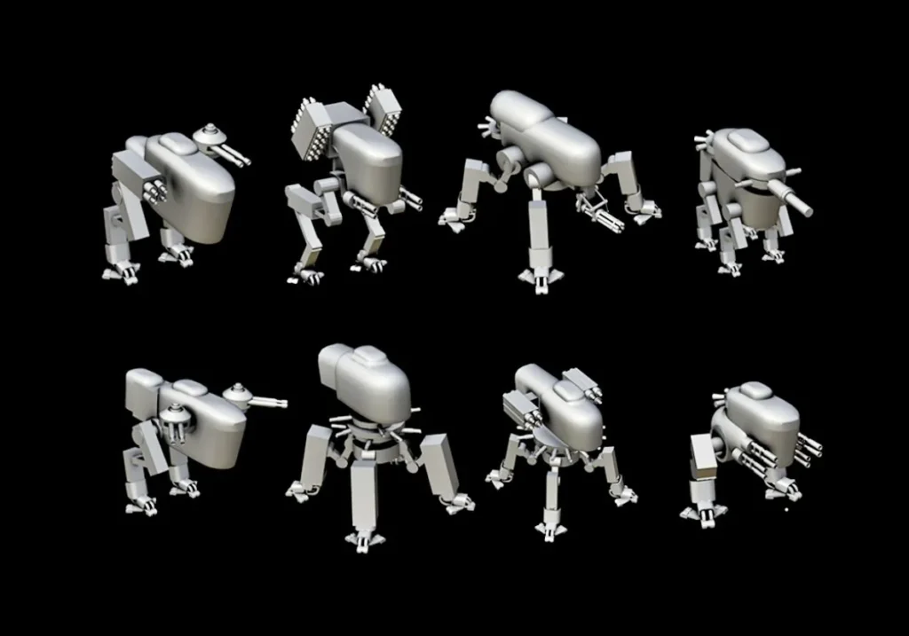
During this phase we also discuss the possibilities for movement and secondary animations, find interesting silhouettes and check which one of the designs will look most appealing from the ingame camera’s perspective. For the 360° mech we found this design quite charming, mostly because of its compact frame and cowboylike stance.
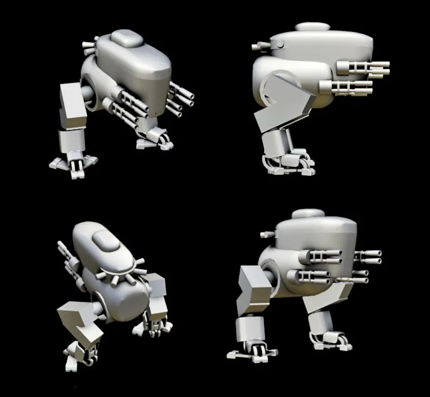
Step 2: Rigging & Animation
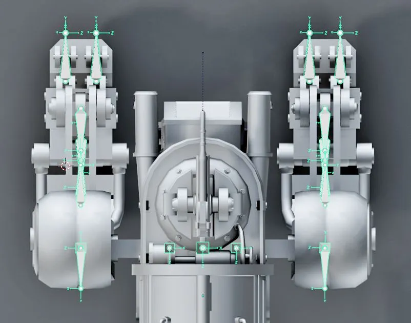
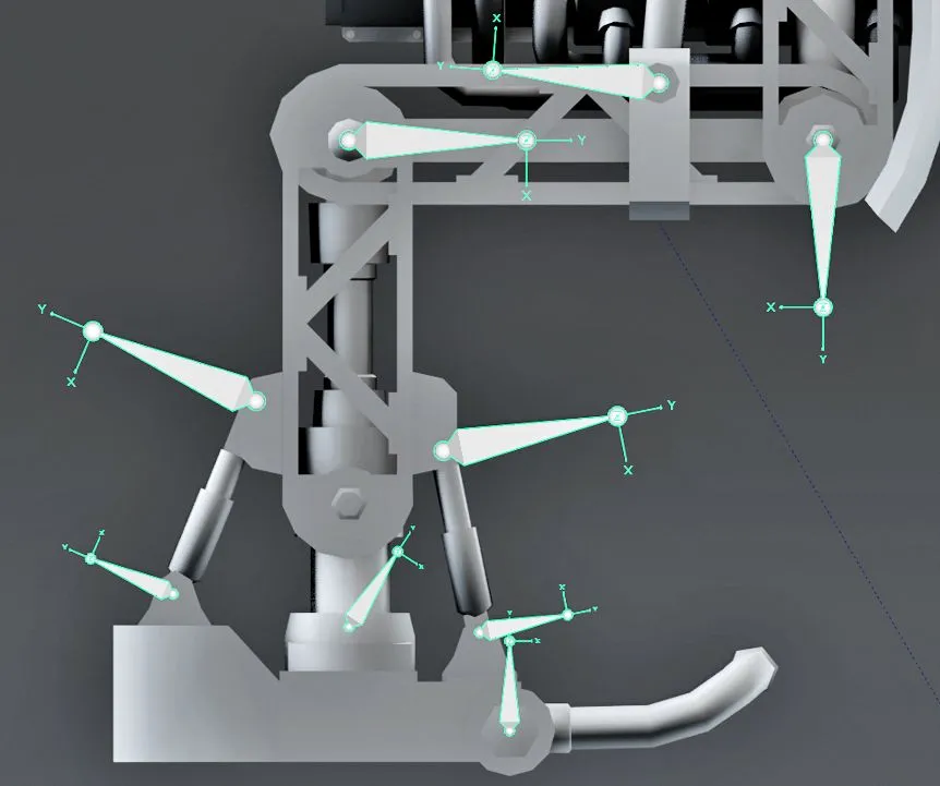
After having the basic proportions, we think about how the functionality of the design could become more believable. The goal is to offer a somewhat realistic mechanical explanation for all the functionality. We discuss the different mechanisms and movement options and adjust the design where necessary based on feedback from our technical artists.
Where possible, we try to exaggerate proportions and movement to make it read better in the zoomed out ingame view (Pic. 3 & 4).
Step 3: Unit Definition
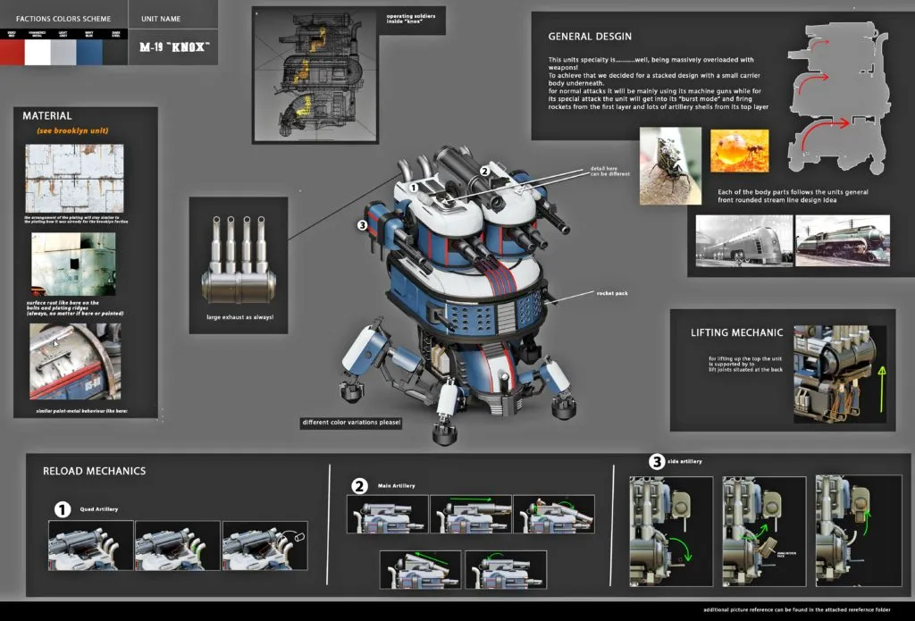
In the picture below you can see one of our Part Definition Documents which we use to communicate certain functionalities to our outsourcers as well as how the final look of the design.
Step 4: Paintover
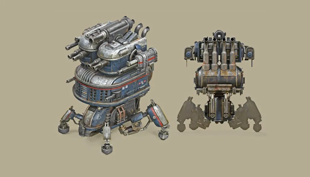
In close exchange with our concepts artist, who uses the blockout mesh as a basis for his paintovers, we define the amount of detail, keeping the ingame perspective in mind, to see which smaller elements, materials and weathering effects could work.
Step 5: Final Model
When everyone approves of the paintover, we then send the blockouts, definition documents and concepts to an outsource studio which was responsible for creating the highpolys and lowpolys, which include meshes for ingame use as well as meshes with a higher resolution for cinematics.
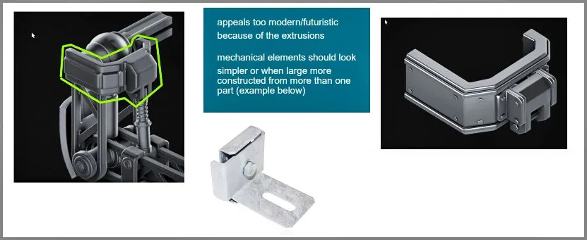
We were constantly updating the outsourcers with feedback to enhance the quality of larger and minor details, such as rivet placement or how some mechanical elements would look more like early 20th century tech. One danger with mechs is always that they can look sci-fi quickly and we needed to find ways to make them look not only plausible but old.
Step 6: Implementation
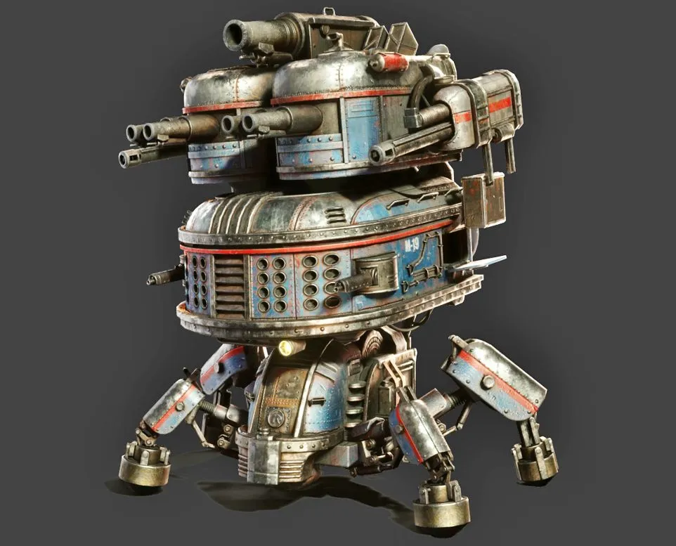
Each final model got hundreds of animations, many effects and sounds and was eventually implemented into the game, ready to be balanced by the game designers. Each unit took a couple of weeks to complete but of course we were working on many units at the same time.
Conclusion
We developed 199 units including mechs, aircrafts, soldiers, hero characters, their pets and NPCs for Iron Harvest. All in all, I would conclude that we’ve made some artistic decisions that gave Iron Harvest a unique look and nailed the 1920s dieselpunk aesthetic. We improved the look throughout the project, learned a lot and optimized our workflow.
We had some problems when it comes to level of details and performance, this includes mesh density, material draw calls and animations. For future projects we a are already thinking about how to reduce the performance costs while still keeping high detail quality or maybe even improve on it further.
Robert Münzinger: Robert joined KING Art Games after he studied Game Design at the University for Applied Sciences in Berlin (HTW) for a few semesters. Having a general passion for art and design, he pursued to develop his abilities in 3D modelling, texturing and concepts while also providing help for marketing and UI.