

How giving up on beloved ideas and learning from mistakes made Good Company a better game.
Good Company’s initial vision literally came to us in a dream. Once everyone on the team had gotten word of it, the vision became unstoppable and spawned a plethora of ideas in each of us.
The notion of starting a small company, growing bigger, and eventually taking over industry is not a new one. In fact, it sits at the core of the tycoon genre. It was the fine print in Good Company’s initial pitch that made the big difference. You’d play as a single person at the centre of something that would eventually grow into an enormous production machinery powered by workbenches, conveyor belts, forklifts, office desks, coffee, and most importantly, people. People who could potentially perform any task the player could, too, from simple crafting and item transportation to supervising and controlling entire departments. It was meant to show you the importance of delegating responsibilities while remaining the one who’s ultimately pulling all the strings. Little did we know back then how much we’d have to trim and bend this vision throughout the next two and a half years to make it a reality.
After endorsing the fact that this was the project we would spend the next several years on, we decided to work on ways to communicate our vision as clearly as possible. We’ve learned from past projects that nowadays getting as many eyes on your game as possible is almost as important for your success as actually delivering a high-quality product. However, figuring out the proper communication of Good Company’s vision was not only important for our ‘marketing first’ approach, but it was also crucial for our internal understanding of the project. Everyone had to be on the same page, and the direction should be as clear as day.
The trailer was one of the first assets we created to communicate the vision of the game. It went through various states before we had the final early access trailer.
Our first prototype was not an interactive one. Instead, we produced a mockup trailer that conveyed the essential aspects of the game. It was clear to us that the player character would be the central element in Good Company; the camera would always be centred on the character, as is shown in the mockup trailer. It tells a story of a person who gets an idea while sunbathing in their front yard and decides to immediately rush into the garage in order to start working on it.
What follows is a montage of the rise and fall of a company, always shown from an isometric perspective and centred on our protagonist. In the end, our CEO gets kicked out of their own company right into the rainy outdoors. A few moments after throwing a last unheard insult at their former colleagues and turning around to wait at the bus stop, a new idea strikes, and we cut to the endslate.
We loved the message that was conveyed there and that it implied so many possibilities. Starting with a clear vision of the game’s theme and tone gave us the advantage of being able to define a very appealing art style and start promoting the project very early on. However, this came at the cost of us neglecting a clear direction in-game mechanics. Initially, we were unaware of this drawback. Eventually, it led us to redesign large parts of the game and even scrap entire systems many times throughout the development.
One of the first UI ideas was to give everything a haptic look & feel based on materials from the real world with stamps, printed paper and signatures.
The Backend Technology Switch
We knew from the very beginning that we wanted to have a cooperative multiplayer mode. There were very few tycoon games (if any) in which you could build a company with your friends. We saw a big opportunity there.
Our conclusion from this choice was that the game has to be divided into two parts. We established a client-server architecture which would also be used during local single-player sessions. The frontend (or client) would be responsible only for rendering, sound, and input processing while the backend (server) would handle all the logic and contain the entire game state. The communication between those two parts is entirely event-based and uses flatbuffers as information packages. This strict architectural separation has proven to be an advantage on many occasions. It helped us to uphold a certain code quality to this day.
While the frontend was made in Unity, the backend used to be implemented in the Go programming language. There were several considerations that led us to pick Go as the backend technology. It featured rich support for concurrency, which we believed would help us implement company simulations with a large number of entities. There were a ton of useful libraries which sped up our development. It also had incredibly fast compile times.
Building the entire backend in Go from scratch could be done almost in an instant. But there were drawbacks as well. We saw no possibility to compile the backend code into a DLL. As a result, playing the game would always mean having two processes running at the same time. Although the Go language features many platforms, it was not intended for game programming. We could port the game to Linux and Mac, but consoles were out of the question.
It was around gamescom 2018 when our plan to focus on marketing and to promote the game early came to fruition. Not only one, but several publishers contacted us. It was not our initial intention to attract publishers. We were rather aiming for slowly but steadily cultivating a fanbase. But the stakes were high, and it would’ve been foolish of us not to consider these offers.
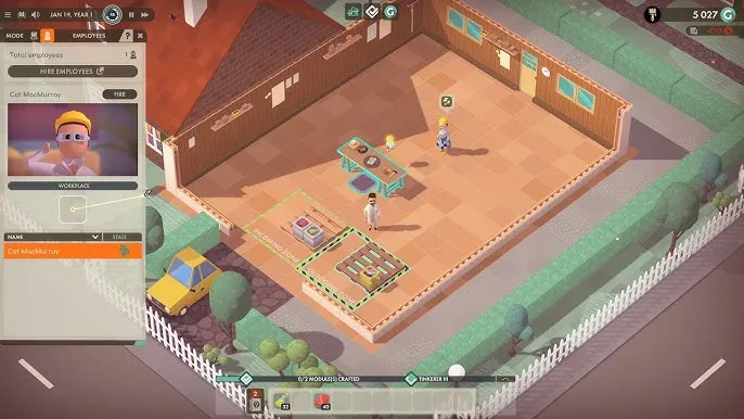
Hiring personnel in the retro OS was one of the rare exceptions which weren’t completely cumbersome for the player.
We ended up in negotiations with multiple parties, one of which we initially saw as our favourite but which only would have partnered with us if they could release Good Company on consoles. There it was: a crossroads. We could turn down the deal that would give us the financial security we desperately needed and continue dabbling in Go, or we could bite the bullet, switch technologies, and bring the project to the next level.
It took us about two months to port the backend to C++. Even though we did not end up partnering with the publisher who required a console port, switching to C++ had more upsides than downsides. We have more experience with C++, and it’s the more established language. There was a better chance to find programmers who knew C++ than Go. Rewriting the backend in C++ while knowing its requirements from its previous implementation also allowed us to improve the architecture immensely. On top of that, the lingering uncertainty of always having two processes running to be able to play the game vanished. We can build the backend in two versions now: a DLL that can be conveniently included in the Unity frontend, and a standalone executable which could later function as a dedicated server for multiplayer sessions.
The UI redesign led to a much clearer interaction concept and a more visually pleasing experience.
Redoing the UI
It’s in the nature of tycoon and production line games to contain a lot of UI, due to the fact that these games deal with a lot of abstract concepts: markets, efficiencies, logistics, or research, etc. These are hard to represent in a physical way, so it was clear at a very early stage that a lot of effort would go into designing an informative and accessible UI.
At the same time, we wanted to capture the tone and feel of the game world with it. It took several misguided attempts until we figured out a UI that did not stand in the way of the players interacting with the game. Our first approach was a skeuomorphic user interface that emulated things like yellow paged notebooks, continuous form paper, paper clips, and folders.
Whenever you would interact with an object in the game world, it would open a panel that resembled a Filofax organizer wallet. The left side would always show the player inventory while the right side would display the state of the object the player interacted with.
It was fine for inventory transfers and crafting but doing more advanced tasks like managing employees or logistics processes required a much more elaborate user interface. This is where RobOS came into play: an additional full-screen UI which opened up as soon as you interacted with your office table. It resembled a CRT screen running an old window manager which was heavily inspired by the earlier versions of the Amiga Workbench. You could start virtual applications for different purposes like material purchasing, managing staff, or inspecting your balance. You could have multiple applications open, drag around each window, minimize and maximize them. It behaved like a real window manager.
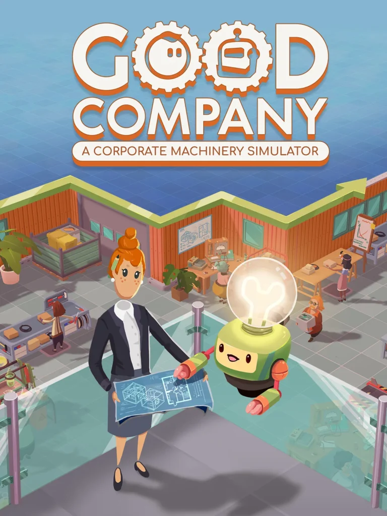
Early character concepts for the ingame consultant.
A lot of love went into the details of RobOS. There were even separate power buttons for the CRT screen and the computer. You could adjust the screen brightness, color balance, and saturation. You could degauss the screen and eject the floppy disc. Each time you turned on the computer it had a short bootup sequence.
It was a thing of beauty – and it was barely usable. While progressing with the design of the increasingly complex game simulation, we noticed quickly that the UI could never accommodate the requirements of the underlying game systems. The Filofax UI took up too much space and blocked the entire screen while the player was interacting with a single entity. And most of the interesting interactions happened in RobOS.
What’s the point of having a beautifully designed game world if players would spend most of their time behind a virtual desk in front of a virtual retro-styled CRT screen? Yes, it had its fair share of immersion, but it also made everything awfully intransparent and awkward to interact with. We had to approach this from a different angle, so we decided to scrap the entire UI and go back to square one.
We wanted the player to have more touching points with the game world while still being able to interact with the more abstract aspects of their company.
This is how we arrived at a more traditional overlay UI which frames the central view on the game world. We let go of the skeuomorphism of our first user interface and got rid of a lot of clutter which made the entire interface hard to read. In its place came clean flat geometric shapes. However, we made sure that a warm colour palette, rounded shapes, and the choice of typefaces reflected a certain nostalgic feel associated with the 70s and 80s computer era.
Naturally, the new interface design and structure underwent several changes throughout the game’s development. But those changes felt more organic and iterative than the time we decided to kill our very first UI entirely.
Early inventory and crafting panel in a Filofax-styled U.
The Logistics Killing Spree
The central problem child in Good Company’s game design was the logistics system. This part of the game by far went through the most incarnations. Even now, after Good Company’s launch into Steam Early Access, it is where our players’ criticism is focused at most frequently. We are aware of all the issues the current system has, and we are actively working on improvements. But it’s worth noting that we entirely redesigned logistics not once but three times before we arrived at what we have now. It was important to get this system right since it’s the fundamental piece on which most other parts of the game depend on. Players would interact with logistics the most, so it was justified to invest more time into a proper design.
Our very first logistics system was similar to low-level programming. You would have to define jobs which were lists of basic actions: pick up, put down, craft, switch recipe etc. Most of those actions had parameters like target objects or settings. Jobs were not defined for specific employees. They were separate entities that could be assigned in your employees’ job queue. This was important because we wanted to have manager employees who would take care of delegating jobs to other employees.
It sounded fun on paper but in reality, it was very fiddly and cumbersome to interact with. It didn’t help that the respective user interfaces for defining jobs and assigning task queues to employees were part of RobOS. It made the whole process even more detached from the actual game world, and it lacked any ostensibility.
We decided to redo the entire logistics and production process. By that time, we also redesigned the UI, so it became easier for us to associate certain UI panels with actual objects in the world. We came up with the concept of workplaces: rectangular areas which acted as configurable cells within the company. Based on its type, a workplace could contain specific equipment like crafters, inventories, or management desks. Logistics workplaces hosted the employees who would take care of all the transportation in your company.
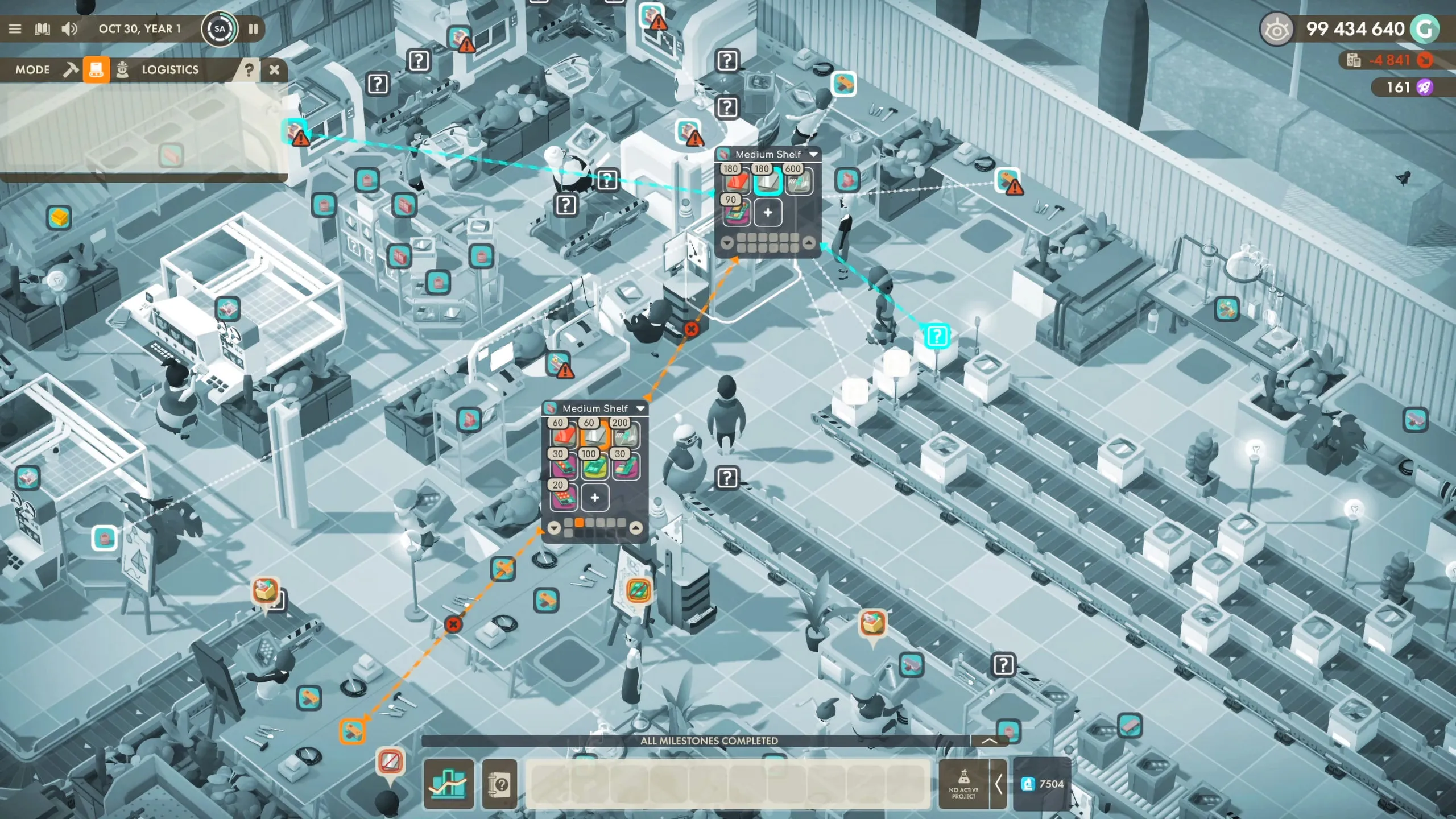
The logistics system and UI already went through numerous iterations but there’s still a lot of potential for improvement.
Just like employees in the previous system, workplaces now had job queues. Employees assigned to those workplaces would pick up a job from the queue and start processing it, which felt way more intuitive than the first system.
Unfortunately, it didn’t scale well, and the resulting setups were very hard to read. The larger your company got, the harder it was to configure and connect things properly. The concept of jobs and job queues was too abstract, and it became tough to keep track of all the workplace settings after a while. We held on to this system for some time, but after several playtesting rounds, it became clear that we had to change the entire logistics system again.
Changing the logistics of Good Company is very expensive since a lot of other systems depend on it and need to be adjusted to new logistics mechanics. The second redesign included getting rid of workplaces as well. We found that workplaces reduced the granularity of the company too much and that it took too many actions to have a first minimal working setup which generated money. Instead, we decided to allow the player to interact with the employees and their equipment more directly. Our goal was to have smaller and simpler building blocks for a company. Complexity had to arise from the connections between the parts, not the parts themselves. Now the player would place storage shelves and crafting tables directly, assign employees to them, and define where the required materials are picked up and where the crafted items are put down.
This approach gave the player more control over their setup, and it worked without tasks, jobs, or job queues. The only thing that gave us a bit of a headache was the question of how exactly the player would define the actual flow of materials through their production chains. We came up with several concepts that used demand and supply settings on inventories or even particular inventory slots. The AI of the logistics employees would interpret these settings and decide which items have to be moved from their respective sources to their destinations and in which order. We went through different kinds of settings the player could adjust for demands and supplies, some more granular than others, with pick up and store thresholds and minimum and maximum stock settings.
The initial vision contained darker elements like weaponry production and rogue AIs. They were dropped in favour of a much friendlier setting.
It was difficult to find a system that enabled players to do everything they wanted without overwhelming them with the sheer amount of buttons and dials. We followed that path for several iterations until we realized it was still the wrong one. Playtests revealed that supply and demand settings were too implicit in being practicable. The only information the player had were the logistics parameters they’ve set on inventories. What decisions the AI would make based on those was unfathomable. As always, this lack of overview became more severe the bigger a company grew. But we knew we had made huge steps in the right direction and with the experience we were gathering we weren’t far away from a working solution.
Looking at other tycoon and production line games, we realized that there were two prevalent approaches to logistics. The first one is to automate most of it and make it work out of the box so the player wouldn’t have to understand it in its entirety. The worst default setup would still work out, and the player would be given opportunities to improve its efficiency by changing some few simple parameters. The second approach was to be very explicit and visual about how the logistics worked and what their exact current state was. We wanted the player to have a lot of control and present them with an interesting system to interact with.
Consequently, we could exclude the first approach and had to find a way to be more explicit and clear about the system’s state and the consequences of the player’s decisions. We couldn’t think of a more explicit and simple definition of a logistics transaction than a line between two points.
The Chasing Carrots team having their daily meeting while social distancing.
This is how we arrived at a connections based logistics system. You could directly define each transportation path by dragging a line between two entities. You could also look at existing lines to inspect which transportation jobs your employees would try to process. Of course, it was apparent that a big company would require a large number of connections which would eventually lead to a lot of routing on the player’s part to get things working. These issues, however, could be addressed with quality of life features which would gradually reduce a lot of friction as we introduced them. For example, we implemented a feature we called batch connections, allowing the player to create multiple connections for different item types between two entities by dragging a single line.
This became the mechanic we launched into Early Access with. It is still far from ideal, and some players are having problems with it, but we see a lot of potential ways to improve it and make it more approachable and efficient. We certainly reached a point from where we can iterate on the existing system until we arrive at the most desirable result.
Other Victims
Besides the Go backend, the first UI, and the numerous logistics approaches there were many other systems that were functional in earlier development versions but had to be cut due to game design decisions. Most of them were tied to how economics worked and how the player’s company would earn money. As always, we wanted to approach things a bit differently compared to similar games. Instead of having a constant product sink that would turn your products into money regularly, we introduced a contract system. Contractors would approach you with a business proposal you could accept or decline – similar to quest in RPGs. Usually, they would require you to build a specific product with certain features within a given amount of time. You could pick available contracts from a list and set up your production accordingly.
Unfortunately, the strict contract deadlines and randomized conditions put a lot of pressure on the player. It was painful and costly to change an existing production line to fulfil a single contract. And in most cases, it wouldn’t make sense to keep a production line after the contract was done because it would’ve stopped generating money. Contracts made establishing a continuous production flow impossible, so we put the concept to rest and introduced a more traditional market system instead. Contracts could eventually become a nice diversion in contrast to the market-driven base game. However, we established that they are not a central part of Good Company.
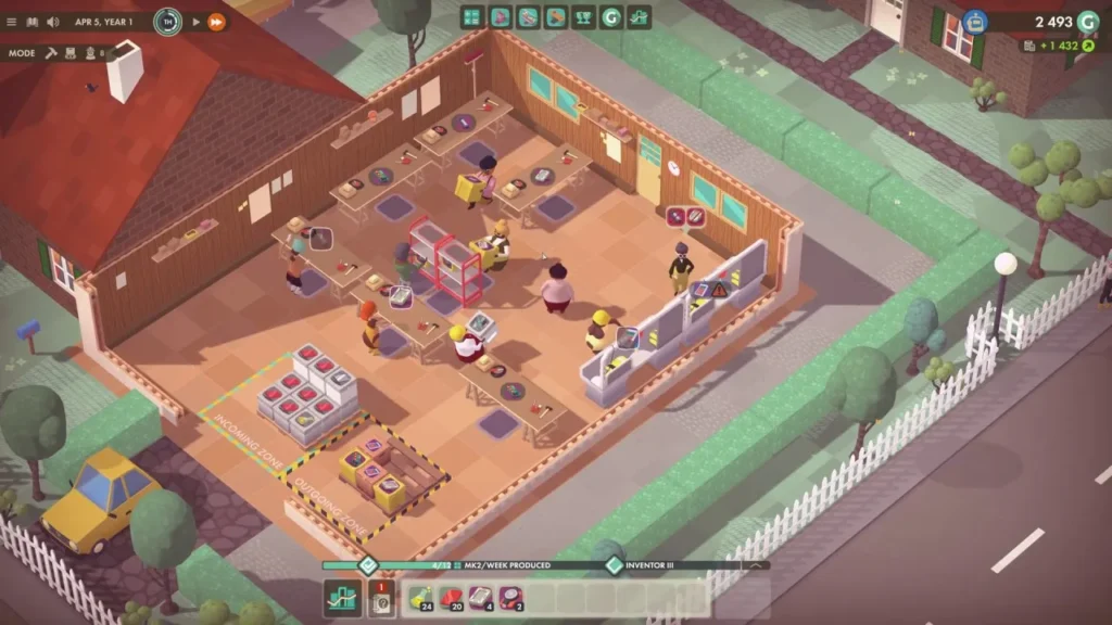
The possibility to zoom out was added shortly before early access. But it provided a much better overview.
Initially, it seemed obvious to us that the player would have to fight for market shares against other companies. We thought that without competitors the player would lack the motivation to progress in the game and, for instance, stop pushing forward in their research efforts or scaling up their production.
To address that risk, our first market system featured very rudimentary competitors. They would be only visible in the market overview, so the player never had direct contact with them in the actual game world. The only thing they did was to release new products once in a while and enter new markets. We did a couple of balancing iterations, but during playtests, competitors always felt very superficial and tacked on.
Balancing the competitors’ AI took a lot of time, and as we were closing in on our Early Access release date. That’s why we decided to leave competitors out for now and go with a market model that emphasized the relationship between the player’s company and their customers. It felt better to postpone this feature to a future update. In general, we preferred to leave things out entirely rather than adding them in a half-baked state and potentially diminishing the impression of the entire game.
Looking back at the development of Good Company so far, it may feel like a bigger part of our work has been eventually thrown away completely. But the experience we gained by trying out unconventional ideas and seeing them fail in the actual product is incredibly valuable for us. We’ve seen the game go through so many radical changes.
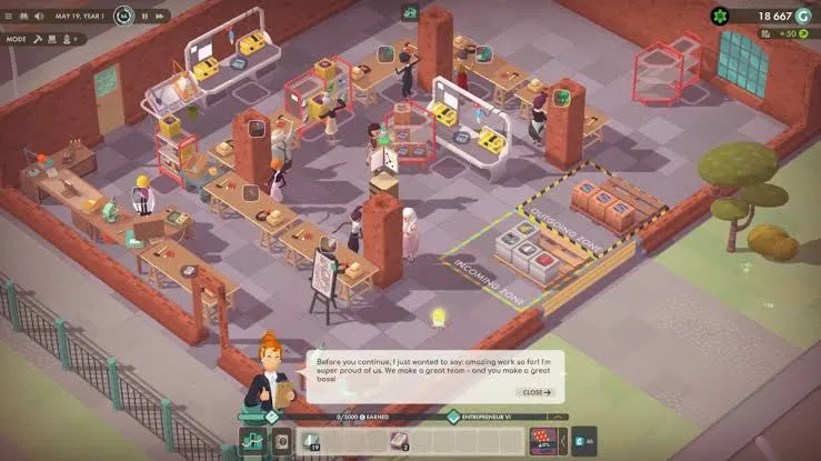
The initial excitement of creating a working ingame retro OS soon turned out to be a UX nightmare.
Whenever we compare the current state of Good Company with earlier builds, we can clearly see that it always was beneficial to the game to abandon certain ideas, no matter how much work we’ve put into them previously or how integral we thought they would be to the original vision. So much so that even during Early Access we aren’t afraid to do incisive course corrections. A prominent example of this is the character-centred camera. Shortly after we launched into Early Access, we received a lot of complaints from players who wanted to be able to look around freely in their company. Our response to this was simple: we introduced an option to detach the camera from the character and allow the players to move across the entire map without restrictions. This was a major departure from our initial vision. But since we are making this game for our community, not for ourselves, it was a change we gladly made without hesitation. We did not regret this step, and our players appreciated the change, which confirmed our stance towards keeping an open mind and not falling in love with your own ideas.
Paul Lawitzki – Lead Game Designer & Programmer
Paul is Programmer and Lead Game Designer at Chasing Carrots. After quitting his engineering job, he started his career in games as a solo developer and freelancer in 2014. While working as a freelance programmer on Pressure Overdrive, he found a cosy home at Chasing Carrots in 2017.